Reading Senegal’s fields from space—84% right, 28% better
A year of weather plays across a field like a time‑lapse: bare soil darkens with the first rains, leaves thicken, then grey into stubble. From orbit, those rhythms look like numbers. In Senegal’s groundnut basin, an open‑source AI model called Tessera learned to read those numbers well enough to name what was growing—most of the time.
The finding lands in a year when scientists describe El Niño as the strongest ever recorded, the kind of climate jolt that scrambles West Africa’s rains and tests food systems. In that context, the study reports Tessera got crop type right 84% of the time in tests and, in one scenario, did 28% better than the next‑best model. The hook is topical. The engine is technical.
Why this is being asked now
Knowing what’s grown where is not trivia; the paper makes clear it allows informed decision‑making at regional, national and global scales. In Senegal, smallholder, rain‑fed farms dominate—so when rains shift, planners need current maps, not guesses from surveys that happen only every few years. The study behind Tessera’s result was published Sept. 29.
The intuition: fields have seasons, satellites see seasons
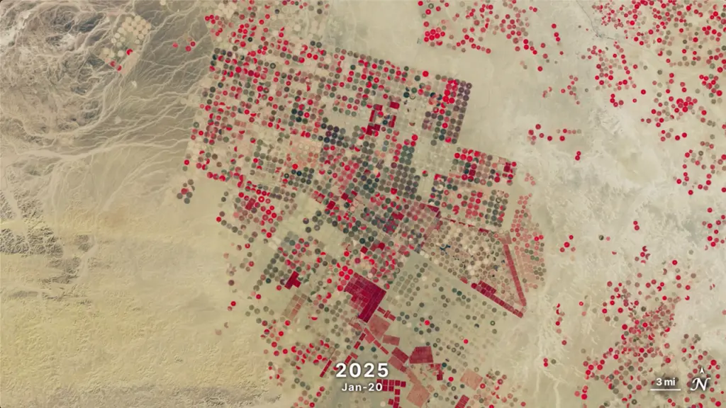
If you’ve ever driven past the same farm all year, you already know the signal: planting turns brown to green, harvest turns green to tan. Satellites track similar changes in reflectance over time. Tessera digests a year’s worth of satellite images for each 10‑meter (33‑foot) dot on the ground and compresses that history into a compact representation.
Think of it like summarising a song into a fingerprint that still captures the beat. The analogy breaks down because fields are not just one “beat”: clouds, weeds and fallow periods add noise, and crops with similar calendars can look deceptively alike from space.
What Tessera actually does differently
The model’s core trick is to turn each pixel’s yearlong story into a string of numbers—an embedding—and then learn to associate those strings with crop labels using limited, existing field data. The study reports that with this approach, Tessera was more accurate than current methods, scoring 84% in tests, while using only a fraction of the computational resources and prelabeled data compared with those baselines.
In one head‑to‑head setup, it outperformed the next‑best model by 28%. That margin matters for ministries or NGOs deciding where to send seed, credit or drought aid: fewer wrong labels mean fewer wrong trucks.
Why not the obvious other way: more ground surveys, bigger models?
Collecting more ground truth sounds simple until you have to hire enumerators to walk fields across a region every season. The study frames Tessera’s appeal as doing more with less: a year of imagery per 10‑meter point, sparse labels, and a representation that generalises across fields. That makes it practical where ground data is difficult or expensive to gather.
Madeline Lisaius, a lead author, puts the bigger picture plainly: Tessera’s biggest advantage is that it brings the power of sophisticated satellite analysis to those who don’t typically have access to it. Accessibility is not a soft benefit—it decides whether a statistical office can run the map this year or not at all.
Failure modes matter: where accuracy dropped and why
The study is candid about limits. It saw a drop in accuracy between 2018 and 2021, which researchers link to the quality of the ground survey data used for training and evaluation. If the labels you learn from are shaky, even a smart model will learn the wrong lesson.
Another gap: it did not test for secondary crops in fields with more than one crop. In diverse, intercropped landscapes, primary‑crop labels can be right while missing a crucial part of what’s actually growing.
What we still don’t know from this study, on purpose
We are not told how performance breaks down by individual crop, how much compute time or memory Tessera used in absolute terms, or how it compares against specific named baselines beyond the 28% edge in one scenario. The study’s results do not report secondary‑crop detection, and they do not resolve how accuracy would change if ground surveys improved or worsened in future years.
The deeper cut
Under the hood: why embeddings help time‑series pixels
Per‑pixel time series from optical satellites are high‑dimensional, irregularly sampled, and noisy. An embedding model trained to compress a year into a fixed‑length vector can denoise by emphasising stable, seasonal structure (e.g., phenological rise/fall patterns) while down‑weighting transients like brief cloud gaps. In practice, this often looks like a learned projection where principal axes correspond to combinations of vegetation indices and their temporal derivatives. The win is sample efficiency: with a good representation, a linear or shallow classifier can separate classes with far fewer labeled points because the embedding already clusters “peanut‑like” vs “millet‑like” trajectories in feature space. That also reduces compute: you embed once per pixel‑year, then reuse. The catch is domain shift—sensor differences, atmospheric conditions, or survey label noise can tilt the embedding so that distances no longer reflect crop differences. The reported accuracy drop between 2018 and 2021 is consistent with representation drift driven by label quality changes. Regularisation, contrastive objectives, and careful temporal normalisation help, but if the ground truth is inconsistent, even an elegant embedding will faithfully compress the inconsistency.
What this enables in plain terms
If you can name crops with 84% accuracy over a region, you can sketch production potential, target extension services, and watch how plantings react to shocks. The paper states that knowing what’s grown where supports informed decisions at scales that can mean survival for vulnerable people. In a year flagged as an extreme El Niño, the case for timely, local crop maps is not abstract.
Crucially, the authors argue this can be done by actors who previously lacked the tooling. If sophisticated analysis reaches desks outside well‑funded agencies, the cadence of agricultural statistics can move from multi‑year lulls to seasonal updates.
The bottom line: better maps, still with caveats
The study’s numbers are straightforward: 84% right overall in tests, and a 28% edge over the next‑best model in one scenario. That’s a material jump over current methods. But accuracy wobbled across years, and intercropping wasn’t evaluated.
For decision‑makers, that means Tessera looks like a strong first pass, not an oracle. Use it to prioritise field checks, to fill in between scarce surveys, and to get a faster read on a volatile season—while keeping an eye on label quality and mixed‑crop fields where today’s method may miss nuance.
The paper: Towards accessible smallholder crop classification in the groundnut basin of Senegal (Environmental Research: Food Systems, 2026)
Sources: AI identifies Senegal's smallholder crops 84% of the time using limited training data (phys.org)
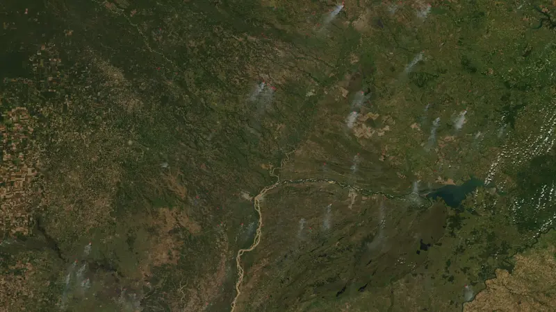
Images: Cover: Everyman Science (illustration); Figure 1: NASA's Scientific Visualization Studio – SSAI/Ross K. Walter / Wikimedia Commons
How this article was made: Everyman Science uses AI tools to structure, format and optimise its articles, and occasionally to produce illustrations where no free photograph exists. The reporting these articles are based on is human-produced and cited above. Spotted an error? Write to [email protected] and we will correct it. — The editors How we work.





Science desk team of Everyman Science, curating and reporting on the day’s most significant developments in research, space exploration, and technology.